Components for displaying dynamic content
Most page components in i-Publisher are static, i.e. you define their content once and it is rarely changed. Imagine we want to show, for instance, a list of our favorite coffee shops in the neighborhood each presented with its name and address. We can simply list them in a text component by using bullets (see the toolbar of the text editor wizard chapter 6.2). In this case, we have to not just fill the necessary information but style each coffee shop entry individually. That's reasonable when we have no more that 5-10 favorite coffee shops, their addresses are not constantly changing and new coffee shops are not opened every day. You can create such a list fairly easy and maintain it easily as well. Imagine you have a library with thousands of books. Listing them in a static list is impossible.
i-Publisher is designed to store and display huge amounts of identically structured data, for instance a library with 100 000 books. The main component used for displaying dynamic content is the list. In the next chapter we will explore the list functionalities available in simple mode (in advanced mode there are much more).
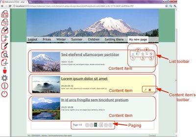
Picture 23
The last three shortcuts are not available until you select what kind of data you want to show and how, i.e. complete the “Edit list” wizard.
Notice that for each content item there is a link ( see how to create linked property in chapter 8.1.c). This link goes to a special details page, i.e. a page designed to display information related to a certain item. The details page usually contains a details component. The purpose of the details component is to display the details of a single content item, instead of a list of items like the list. Usually, when you create a list of items you display the least possible information enough to uniquely identify each item among the whole collection. In the case of the library, this would be the title and the author of certain book. There is no need to display the content of each book in the list. If your reader finds the book, identified by its title and author, interesting, he/she would follow the link and explore all the details of the selected book, including the year, price, publishing house, abstract, reviews, etc. This is the purpose of the details widget – to display the details of a certain item. The place of the text analysis components (see chapter 9) is also in the details page.
In the picture above you can see how a typical list looks like. Our list has 4 to 6 items (in our case 4, although it is not visible in the picture) grouped into two pages, each showing up to three items. The paging fragment you can see below switches between the pages. As described before, each item can be edited or deleted directly form the list via its toolbar (see chapter 3.2.b) ). The toolbar menu of the list consists of four shortcuts:
- Edit list – opens list visualization wizard. From this wizard you can choose what kind of items you want to show in the list and define their visualization;
- Translation wizard shortcut – see chapter 10.2. b);
- Edit data – select which items from the currently selected type would be displayed;
- Edit order – define how your items will be ordered
- Add content – Read more about dynamic content in chapter 5.
-
Choose a content type – choose a content type you want to display items from or create new. The same as the “Create content” wizard first step ( see chapter 5 ).
-
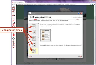
Choose visualization – choose how each of your items will be displayed
The variety of templates depends on the variety of properties of the selected content type. Each visualization type defines how individual content items will be displayed and consists of placeholders designed to show different kinds of properties.
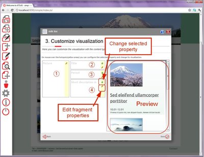
Picture 25
In the picture above you can see how one visualization type looks like. As mentioned above, it consists of different placeholders(fragments). Each placeholder contains one property of a certain kind. In our case there are four placeholders – the one to the left (1) is for image properties, the topmost two in the right column (2, 3) are for short text properties and the last one (4) – for long text. You can deduce the purpose of and the style applied to each placeholder by the image in the previous step. Each fragment has a simple toolbar with at most two shortcuts – “Change selected property” and “Edit fragment properties”. When you click on the “Change selected property” button a list with all suitable for this fragment properties opens and you can select one of them. This button is invisible when only one property from the selected content type is suitable. The “Edit fragment properties” opens a small dialog that allows you to configure the selected fragment. Here are some of the properties you can configure:
-
Linked – whether the containing property would be displayed as a link to the details page or not
-
Width and Height (for images only) – the width and height of an image
-
Lightbox (images only) – when you click on certain image it can be opened in higher resolution(if possible) in a new pop up window. You can configure whether you want this to happen or not as well as the maximum width and height of the new image.
-
Alt (images only) – the text that would be displayed if the image cannot be rendered
-
Trimmed (text properties) – whether to show just the first few characters from a single text property if the text is too long. The number of characters to show is defined by the value of “Trim size”.
d. Click “Done” and your list is ready. Follow one of the links to the details page and define the visualization of the details widget in a similar to the described in this chapter way. It is important to configure the details to display items from the same content type as the list.
Edit data wizard
The “Edit data” wizard allows you to filter content items from the selected type and display only a part of them in the list
-
No filter – all items from the selected type will be displayed
-
Handpicked items – you can configure the list to show only a few items selected manually. You can search among all items from the selected type. Choose which of them you want to display by drag-and-drop. Reorder the selected items again by drag-and-drop.
-
Custom filter – filter items by certain criteria. Click on “Configure data filter” and a pop up opens where you can define the criteria the value of each property from the selected item should meet.
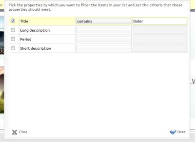
Picture 26
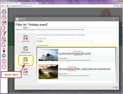
In the picture above, you can see an example filter. This filter filters our “Holiday events” by their title and tells the list to show only those “Holiday events” which title contains “Dolor”.
Picture 27
In picture 27 you can see the result of the “Dolor filter” in the preview area. Notice that the initial list that originally contained four items is now reduced and contains only two items. Both of these items contain the character sequence “dolor” in their names.
d. Give your filter a name, for instance “Dolor filter” and click the “Done” button. The wizard closes and the list in your page is filtered as well. When you open the “Edit data” wizard again, you will see your “Dolor filter” in the list to the right (see Picture 27). Feel free to create as many filters as you want.
Edit order wizard
This wizard has two steps – the paging and the actual order
-
Paging
Imagine you have 100 000 books. It is not reasonable to show them all at once. Your reader will have to scroll forever to find the book he/she needs. In addition, your website will be really slow and practically unusable. The most popular approach is to add a paging fragment (see Picture 23.) to navigate through the list. The idea is that you display only a portion of your data, for instance 10 items, at once, i.e. on one page. This number can be configured in here.
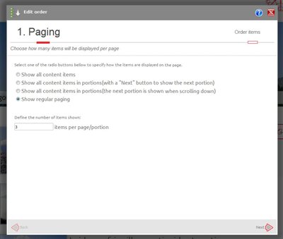
Picture 28
In picture 28 you can see how the paging for the list in picture 23 was configured. The page size is set to 3. Thus, you see three items and a paging fragment allowing you to go to the second page and see the last fourth item. If you want to see a paging fragment like this, select the “Show regular paging” option. “Show all content items” displays all item on one page. If you plan to have more than 20-30 items don't use that option. Appending a “Next” button means that instead of the regular paging fragment, you will see only a next button. To append next page when scrolling means that instead of a paging fragment you will see a loading icon for a while and then the items from the next page would be appended to the bottom of the list.
b. Order
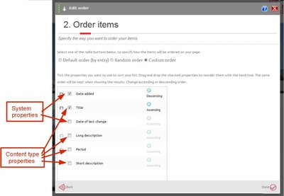
Picture 29
There are different ways to order(sort) your items. Items come in an almost(but not exactly) random order that depends on the database used. This order is called “Default order”. Don't depend on this order because its behavior is unpredictable. To display, for example, 3 randomly selected books from your collection, choose the “Random order” with page size three. No paging is allowed for lists ordered with random order because the results are unpredictable and usually confusing. The “Custom order” allows you to order your items by some of their own properties (the properties of the content type they were created from; not all types of properties are suitable for sorting) and some system ones. Books are usually ordered by title, news – by date, students by their IDs, etc. Sometimes we want a more complicated order, for instance, we may sort a list of movies by title and the movies with equal titles – by year. This is a two-level sorting as shown in picture 29. In our case, we sort events first by the system property “Date added” (when the item was created) and then by “Title”. Properties can be reordered because sorting by “Date added” and then by “Title” is different from sorting by “Title” and then by “Date added”. You can also change the sorting order – ascending or descending. Sorting by “Date added” ascending means that the “smaller” dates are in the beginning of the list, i.e. the newly created items will be sent to the end of the list. In our case the events are ordered by “Date added” descending. Thus, when you add new item it will be displayed in the beginning of the list.
ATLAS (Applied Technology for Language-Aided CMS) is a project funded by the European Commission under the CIP ICT Policy Support Programme.


